WPF layout system helps in having fine grained control over the placing of controls.
Since I am more into the web domain I am most comfortable with the Grid which is the most versatile of the built in layout panels available in WPF.
Grid mimics the familiar html Table tags.
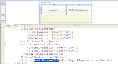
Here I am creating a Grid with 3 rows.
I am add two columns using ColumnDefinitions.
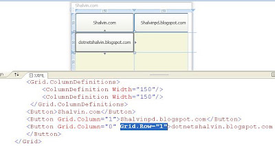
Now if a add a button to the Grid it will appear in the first row and column (zero based index). If I again add one more button to the grid the second button the take the precedence and hides the first button. It is possible to specify in which column the control should appear using Grid.Column and specifying the column number as sholwn in the figure below.

We can also specify the column number using Grid.Column.


We can also specify the column number using Grid.Column.

 <Window x:Class="WPFLayout.MainWindow"
     xmlns="http://schemas.microsoft.com/winfx/2006/xaml/presentation"
     xmlns:x="http://schemas.microsoft.com/winfx/2006/xaml"
     xmlns:d="http://schemas.microsoft.com/expression/blend/2008"
     xmlns:mc="http://schemas.openxmlformats.org/markup-compatibility/2006"
     xmlns:local="clr-namespace:WPFLayout"
     mc:Ignorable="d"
     Title="Shalvin" Height="450" Width="800">
   <Grid ShowGridLines="True">
     <Grid.RowDefinitions>
       <RowDefinition Height="50"/>
       <RowDefinition Height="50"/>
       <RowDefinition Height="50"/>
     </Grid.RowDefinitions>
      <Grid.ColumnDefinitions>
        <ColumnDefinition Width="150"/>
        <ColumnDefinition Width="150"/>
        <ColumnDefinition Width="150"/>
      </Grid.ColumnDefinitions>
     <Button>Shalvin.com</Button>
     <Button Grid.Column="1">shalvinpd.blogspot.com</Button>
   </Grid>
 </Window>


No comments:
Post a Comment